How to create your own scrollbar for galleries in Power Apps
tl;dr
Did you know that two buttons and a slider make a sweet scrollbar? Let me show you how to do it!
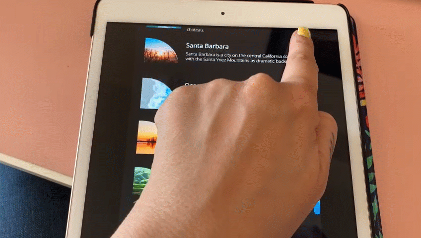
In my last blog post about How to build a curved gallery in Power Apps I already showed how you can use a slider to scroll through a horizontal gallery, and we hid that slider. This post shall show you how you can create your own scrollbar to navigate a vertical gallery.
To make this as flexible and reuasable as possible, we will componentize this.
create a component
- Create a new component
cmp_scrollGalleryand add the following custom properties to it:
galleryStyles (Record): {X:0,Y:0,Width:cmp_scrollGallery.Width,Height:cmp_scrollGallery.Height}
galleryContent (Table):
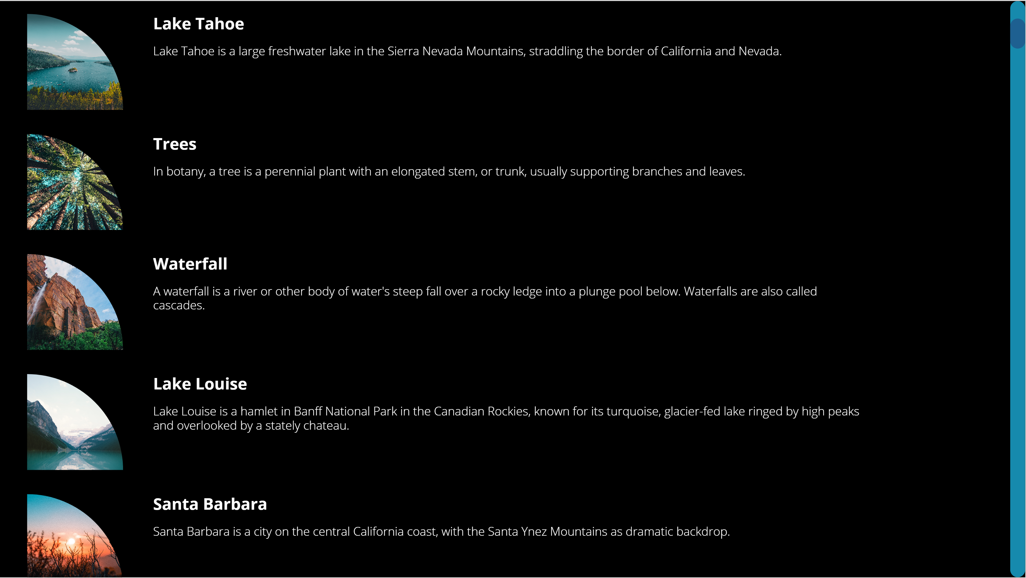
Table({id:1,image:'image1',title:"Lake Tahoe",description:"d1"},{id:2,image:'image2',title:"Trees",description:"d2"},{id:3,image:'image3',title:"Waterfall",description:"d3"},{id:4,image:'image4',title:"Lake Louise",description:"d4"},{id:5,image:'image5',title:"Santa Barbara",description:"d5"},{id:6,image:'image6',title:"Ocean",description:"d6"},{id:7,image:'image7',title:"Beaver Dam",description:"d7"},{id:8,image:'image8',title:"Green",description:"d8."})
sizeWidth (Number): App.DesignWidth
sizeHeight (Number): App.DesignHeight
sliderStyles (Record): {X:cmp_scrollGallery.Width,Y:0,Width:50,Height:cmp_scrollGallery.Height}
backgroundBarColor (Color): ColorValue("#168aad")
scrollBarColor (Color): ColorValue("#1e6091")
scrollbarStyles (Record): {X:cmp_scrollGallery.galleryStyles.Width-20,Y:0,Width:20,Height:cmp_scrollGallery.Height}
titleStyles (Record): {Font: Font.'Open Sans', FontSize: 16, FontWeight: Bold, Color: White, Width: cmp_scrollGallery.galleryStyles.Width*0.5, Height:40, X: cmp_scrollGallery.imageStyles.X+cmp_scrollGallery.imageStyles.Width +40 } |
imageStyles (Record): {Width:128, Height: 128, BorderTopLeft: 0, BorderTopRight: Self.Width, BorderBottomLeft: 0, BorderBottomRight:0,X: 16}
bodyStyles (Record):{Font: Font.'Open Sans', FontSize: 12, FontWeight: Lighter, Color: White, Width: cmp_scrollGallery.galleryStyles.Width*0.7, Height:40, X: cmp_scrollGallery.imageStyles.X+cmp_scrollGallery.imageStyles.Width +40 }
- Set the Width of the component to
cmp_scrollGallery.sizeWidthand the Height tocmp_scrollGallery.sizeHeight
gallery
We will now add a gallery and refer to our custom properties.
- Upload a few images
- Add a horizontal gallery
gal_1 - Set the ShowScrollbar property to
false - Set its items property to
cmp_scrollGallery.galleryContent - X:
cmp_scrollGallery.galleryStyles.X, Y:cmp_scrollGallery.galleryStyles.Y, Height:cmp_scrollGallery.galleryStyles.Height, Width:cmp_scrollGallery.galleryStyles.Width
image in the gallery
- Add an image
imgto the gallery, set its Image property toThisItem.image - X:
16, Width:cmp_scrollGallery.imageStyles.Width, Height:cmp_scrollGallery.imageStyles.Height - Add a button to the gallery, (I liked it to be semi transparent) and set its X to
img.Xand its Width*toimg.Width` - RadiusTopRight:
cmp_scrollGallery.imageStyles.BorderTopRight, all other Radius… properties shall be0- this creates this quarter circle effect - TemplatePadding:
20, TemplateSize:140
title text label in the gallery
- Add a text label
lbl_title - X: cmp_scrollGallery.TitleStyles.X, Y:
img.Y, Width:cmp_scrollGallery.TitleStyles.Width, Height:40 - Color:
cmp_scrollGallery.TitleStyles.Color, Font:cmp_scrollGallery.TitleStyles.Font, FontWeight:cmp_scrollGallery.TitleStyles.FontWeight, Size:cmp_scrollGallery.TitleStyles.FontSize - Set its Text property to
ThisItem.title
description text label in the gallery
- Add a text label
lbl_description - X: cmp_scrollGallery.bodyStyles.X, Y:
img.Y, Width:cmp_scrollGallery.bodyStyles.Width, Height:40 - Color:
cmp_scrollGallery.bodyStyles.Color, Font:cmp_scrollGallery.bodyStyles.Font, FontWeight:cmp_scrollGallery.bodyStyles.FontWeight, Size:cmp_scrollGallery.bodyStyles.FontSize - Set its Text property to
ThisItem.description
Now that we have the gallery, lets make it scrollable. We will add a slider control and hook this the Y property of the image. 💡 The Y property of all other controls in the gallery depends on img.Y
slider
- Add a vertical slider
sli_gal - X:
cmp_scrollGallery.sliderStyles.X-Self.Width, Y:cmp_scrollGallery.sliderStyles.Y, Height:cmp_scrollGallery.sliderStyles.Height, Width:cmp_scrollGallery.sliderStyles.Width - Set its Min to
gal_1.TemplatePadding+btn_ScrollBar.Height/2, its Max togal_1.Height+gal_1.TemplatePadding-btn_ScrollBar.Height/2and its Default to50 - Set the HandleSize to
50 - Now set all color values to
Transparent- we want to make the slider disappear. Don’t set the visible property tofalse- users can’t interact then with the control anymore
Now the most important step: Go back to img.Y and set it to sli_gal.Value-gal_1.Height+gal_1.TemplatePadding. You can now move the hidden handle and see that the items in the gallery in fact scroll :-)
Now we want to add the scroll bar:
2 buttons
Yes, for real. Our scrollbar only consists of two buttons, one for the background bar and one for the actual scroll bar
background bar
- Add a button
btn_backgroundBar, set its DisplayMode toView, we don’t want users to interact with it. - X:
cmp_scrollGallery.scrollbarStyles.X, Y: 0, Height:cmp_scrollGallery.Height, Width:20 - Fill:
cmp_scrollGallery.backgroundBarColor
scroll bar
- Add a button
btn_scrollBar, set its DisplayMode toView - X:
cmp_scrollGallery.scrollbarStyles.X, Y:sli_gal.Height-sli_gal.Value+Self.Height/2-gal_1.TemplatePadding, Height:40, Width:20 - Fill:
cmp_scrollGallery.scrollBarColor
As a last step, rearrange the controls so that the slider is on top
Feedback and what’s next?
Who would have thought that its that easy to create your own custom scrollbar? Adjust sizes and colors as you please, and let me know on twitter how you like it!

My name is
Luise Freese
You May Also Like
How to build a curved gallery in Power Apps
tl;dr Galleries in Power Apps do not have to look boring. With a little creativity we can create a curve effect. gallery Upload a few images Add a horizontal gallery gal Set the ShowScrollbar property …
How to build a swipe-right component in Power Apps
tl;dr Your canvas apps do not have to look ugly. This blog post guides you how to build a swipe-right component that you can reuse across apps. What we are going to build Create the Component with …
How to build a split button component for Power Apps
tl;dr Less controls mean less user confusion and better performance - This blog post guides you through the creation of a simple yet effective split button component. Let’s create a component …