Build a progress button with me (yes it is a component)
tl;dr
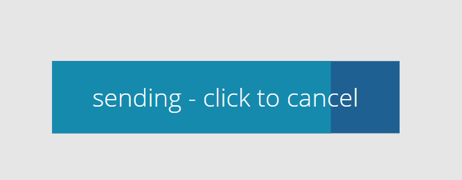
You know that feeling when right after hitting that send button you still want to edit something or changed your mind? This progress button allows people to rethink again and change their minds.
Why would we need a progress button?
My proofreading skills improve by at least 200% after I hit a send button. If you feel your users could use a little think again option, this progress button is for you.
Desired goal: Once a user selects the Send request button, the button shall fill in a different color, linear progressing from left to right and display a text like sending... click to cancel. If the user selects that button now again to cancel the action, we want to reset that Fill and Text to the original state.
Build the component
As we want to make this as reusable as possible, we will invest some time to create it as a component.
Set the custom properties
- backgroundFill (Color) :
ColorValue("#1e6091") - progressFill (Color):
ColorValue("#168aad") - textColor (Color):
White - progressbuttonHeight (Number):
40 - progressbuttonWidth (Number):
200 - labelContent (Table):
Table(
{
id: 1,
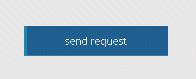
text: "send request"
},
{
id: 2,
text: "sending... click to cancel"
},
{
id: 3,
text: "sent"
}
)
- Now set ths OnReset property of the component to
Set(cmp_labelTrack,1);Set(cmp_timerRun,false)
Controls
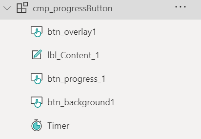
Add
- 3 buttons
btn_background,btn_progressandbtn_overlay - 1 labels
lbl_Content - 1 timer
Timer1
- 3 buttons
to the component
- Set all of these to the same Width:
cmp_progressButton.progressButtonWidth, Height:cmp_progressButton.progressButtonHeight, X:5and Y:5, so that they overlap. Order them so that the overlay button is on top, thelbl_Contentis on top ofbtn_progressand thebtn_progressis on top of thebtn_background
- We will want to set the initial state of our label in the OnVisible of the screen
Reset(cmp_progressButton_3)
Overlay button
This button is the one that contains all the magic:
- Set its OnSelect to
Set(cmp_timerRun,!cmp_timerRun);Set(cmp_labelTrack,2);
as we want to start/stop a timer and control which row of our content we want to display in the text label.
- Set all Colors of this button to
Transparent- we want it to visually disappear. Don’t set the Visible property tofalse- users can’t interact then with it. - Set the Text property to
""- we don’t need any text in here.
Text label
- Set the Text property of the label to
LookUp(cmp_progressButton.labelContent,id=cmp_labelTrack, text)- This makes sure OnVisible of the screen (cmp_labelTrack= 1), we displaysend request, while once our user selected the button (cmp_labelTrack= 2) we displaysending... click to cancel. We will later adjust the timer so that the last textsent!is being displayed OnTimerEnd.
Background button
This is the button that looks as if it was the one people click on - but as we have an overlap with the overlay button, it shall just look pretty - I liked it plain and simple and went for Radius: 0.
- Set its DisplayMode to
View- users won’t interact with it. - Set its Text to
"" - Set its Fill to a
cmp_progressButton.backgroundFill, make the BorderColorTransparentand let HoverBorderColor, PressedColorBorder =Self.Fill
progress button
This is the button that fill up from left to right once user selects the overlay button
- Set its Fill property to
cmp_progressButton.progressFill - Make the BorderColor
Transparentand let HoverBorderColor, PressedColorBorder =Self.Fill - Set its Text to
"" - Set its Width to
cmp_progressButton.progressButtonWidth*(Timer.Value/Timer.Duration)- this means that at any given point the Width of the button will be determined by the progression of the running timer - Set HoverFill to
btn_background.Fill
Timer
It’s time to take care of the Timer control
- AutoStart:
cmp_timerRun - OnTimerEnd:
Set(cmp_labelTrack, 3);Set(cmp_timerRun, false)- as mentioned above - we now display the third text in the label - Reset
!cmp_timerRun - Duration:
2000(milliseconds)
one more thing…
To make this component fully adjustable, now add two more custom properties to it:
- sizeWidth** (Number):
btn_background.Width+10 - sizeHeight** (Number):
btn_background.Height+10
Adjust X and Y of the btn_background to 5.
That’s it!
Feedback and what’s next?
Would you like to include such a button? Please let me know on twitter.

My name is
Luise Freese
You May Also Like
Can you make it pop?
tl;dr Want to improve your app design and your galleries? Learn how to make your galleries pop out and get this very dynamic look and feel! There are a few things you can do to make your galleries …
How to create your own scrollbar for galleries in Power Apps
tl;dr Did you know that two buttons and a slider make a sweet scrollbar? Let me show you how to do it! In my last blog post about How to build a curved gallery in Power Apps I already showed how you …
How to build a curved gallery in Power Apps
tl;dr Galleries in Power Apps do not have to look boring. With a little creativity we can create a curve effect. gallery Upload a few images Add a horizontal gallery gal Set the ShowScrollbar property …