How to build a Power Apps Likert component
tl;dr
Power Apps components allow makers to reuse fragments and patterns of their work to ensure design consistency and developer productivity. This Likert component showcases also custom properties and is an alternative way to gather data from users.
What are components and why would you want them?
Makers can create reusable building blocks and save them as components to either use them in a specific app or to use them across apps with a component library. Benefits of creating components:
- build once, use repeatedly - no need to reinvent the wheel over and over again
- if a component needs to be updated, it is updated once which will be reflected in all instances that are used inside of an app
- design consistency
- enhanced user experience due to standardization
- increased developer velocity
- improved productivity
Creating components is an investment into better performing, good looking, easy debuggable and maintainable apps. It’s true, that the initial effort of building them is a bit higher than using regular controls (when only used one time), but the more a component is used and the more complex an app gets, the better is the return on investment of creating components.
Likert component: result
To give you an idea how the likert component looks like, you can watch it here in action
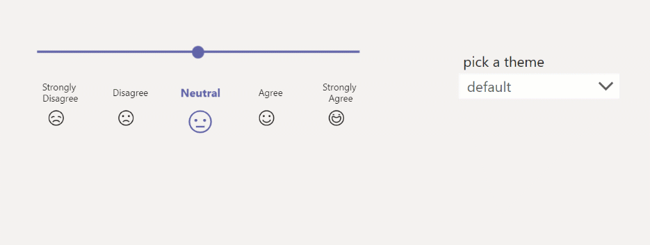
Nice thing about it: It is already working in three different themes (default, dark, high contrast) and the design matches Microsoft Teams. To make this happen, we need to adjust the OnStart property of our app to this code:
// THEME
Set(
    gblThemeDark,
    Param("theme") = "dark" Or drp_dropdown.SelectedText.Value = "dark"
);
Set(
    gblThemeHiCo,
    Param("theme") = "contrast" Or drp_dropdown.SelectedText.Value = "high contrast"
);

Set(
    gblAppColors,
    {
        // Fluent Design Colors
        HighContrastDisabled: ColorValue("#2EF149"),
        HighContrastHyperlinks: ColorValue("#FFFD39"),
        HighContrastSelectedBackground: ColorValue("#00EBFD"),
        HighContrastSelectedText: ColorValue("#000000"),
        NeutralWebGray30: ColorValue("#EDEBE9"),
        OverlayTransparent: RGBA(0,0,0 0),
        TeamsDarkTint10: ColorValue("#6264A7"),
        TeamsDefaultPrimary: ColorValue("#6264A7")
    }
);
Build the component
- Create a new canvas component and add
- a slider control
- a gallery with
- a textlabel
- an icon
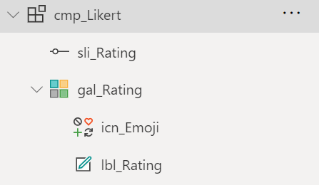
- Create custom properties:
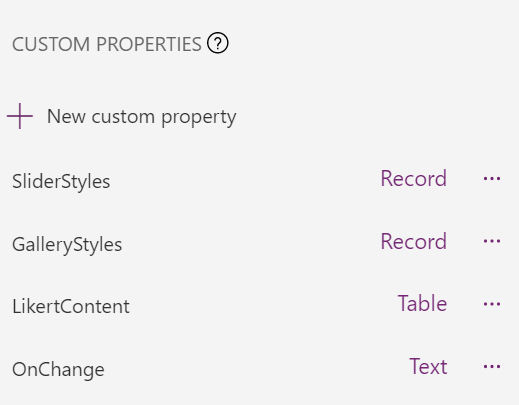
SliderStylesas Record, add this code:
{
BorderColor:
If(gblThemeHiCo,gblAppColors.OverlayTransparent,gblThemeDark,gblAppColors.OverlayTransparent,gblAppColors.OverlayTransparent),
DisabledBorderColor:
If(gblThemeHiCo,gblAppColors.HighContrastDisabled,gblThemeDark,gblAppColors.NeutralWebGray150,gblAppColors.NeutralWebGray30),
FocusedBorderColor:
If(gblThemeHiCo,gblAppColors.HighContrastSelectedBackground,gblThemeDark,gblAppColors.TeamsDarkTint10,gblAppColors.TeamsDefaultPrimary),
HandleActiveFill:
If(gblThemeHiCo,gblAppColors.HighContrastHyperlinks,gblThemeDark,gblAppColors.TeamsDarkTint10,gblAppColors.TeamsDefaultPrimary),
HandleFill:
If(gblThemeHiCo,gblAppColors.HighContrastHyperlinks,gblThemeDark,gblAppColors.TeamsDarkTint10,gblAppColors.TeamsDefaultPrimary),
HandleHoverFill:If(gblThemeHiCo,gblAppColors.HighContrastHyperlinks,gblThemeDark,gblAppColors.TeamsDarkTint10,gblAppColors.TeamsDefaultPrimary),
RailFill:
If(gblThemeHiCo,gblAppColors.HighContrastHyperlinks,gblThemeDark,gblAppColors.TeamsDarkTint10,gblAppColors.TeamsDefaultPrimary),
RailHoverFill:
If(gblThemeHiCo,gblAppColors.HighContrastHyperlinks,gblThemeDark,gblAppColors.TeamsDarkTint10,gblAppColors.TeamsDefaultPrimary),
ValueFill:If(gblThemeHiCo,gblAppColors.HighContrastHyperlinks,gblThemeDark,gblAppColors.TeamsDarkTint10,gblAppColors.TeamsDefaultPrimary),
ValueHoverFill:
If(gblThemeHiCo,gblAppColors.HighContrastHyperlinks,gblThemeDark,gblAppColors.TeamsDarkTint10,gblAppColors.TeamsDefaultPrimary),
Default:3
}
which references the colors of the slider control to the ones that we set in OnStart of the app and sets the default value to 3.
GalleryStylesas Record, add this code:
{Color: gblAppStyles.Label.Color}
which references the colors of textlabel and icon
LikertContentas Table, add this code:
Table(
    {
        Id: 1,
        Body: "Strongly Disagree",
        Icon: Icon.EmojiFrown
    },
    {
        Id: 2,
        Body: "Disagree",
        Icon: Icon.EmojiSad
    },
    {
        Id: 3,
        Body: "Neutral",
        Icon: Icon.EmojiNeutral
    },
    {
        Id: 4,
        Body: "Agree",
        Icon: Icon.EmojiSmile
    },
    {
        Id: 5,
        Body: "Strongly Agree",
        Icon: Icon.EmojiHappy
    }
)
which populates our gallery with an id (serves also as rating), the text to be displayed in the label and the icon to be displayed.
OnChangeBehavior as Text, add one parameterRatingas Number. When we later ad an instance of our component to an app, we will call this function and update it to pass the current value from the slider.
- Work on the Slider
- Set the Default property to
cmp_Likert.SliderStyles.Default - Set the OnChange property to
cmp_Likert.OnChange(sli_Rating.Value)
- Work on the Gallery
- Set the Items property to
cmp_Likert.LikertContent - Set the Icon property of the icon to
ThisItem.Icon - Set the Text property of the textlabel to
ThisItem.Body - Set the Height and Width properties of the icon to
If(sli_Rating.Value= ThisItem.Id, 30, 20) - Set the Size property of the textlabel to
If(sli_Rating.Value= ThisItem.Id, 11, 9) - Set the FontWeight property of the textlabel to
If(sli_Rating.Value= ThisItem.Id, Bold, Normal) - Set the Color property of the icon to
If(sli_Rating.Value= ThisItem.Id, cmp_Likert.SliderStyles.HandleActiveFill, cmp_Likert.GalleryStyles.Color)
Add the component to your app
Now that our component is complete
- Add it to the app
- Set the OnChange property to
Set(gbl_likeValue, Rating)
What happens now is, that when you move the slider, the current value label and emoji are emphasized and a we store the current value in a variable.
Feedback & What’s next
I am curios - where would you use such a component? Can it replace rating DataCards? Which enhancement would you like to see? Tell me on twitter.

My name is
Luise Freese
You May Also Like

How to implement a Power Automate progress indicator in Power Apps
tl;dr: An indicator to show the progress of a Power Automate flow Especially when users need to perform several tasks to complete a workload, they like to know, if the thing worked. Simple …

How to enhance maker experience with a custom theme for Teams apps
tl;dr Creating beautiful UI in Power Apps canvas apps is hard - even more when the app shall run in the context of Microsoft Teams, as there is no theme out-of-the-box that matches Teams look and feel …
How to build a color-contrast-ratio checker for improved accessibility in Power Apps
tl:dr Color contrast ratio is important for accessibility - here is how to build an in-app checker to build more accessible Power Apps What is an color-contrast-ratio checker and why would I care? …