How to make a auto-height textinput component for Power Apps
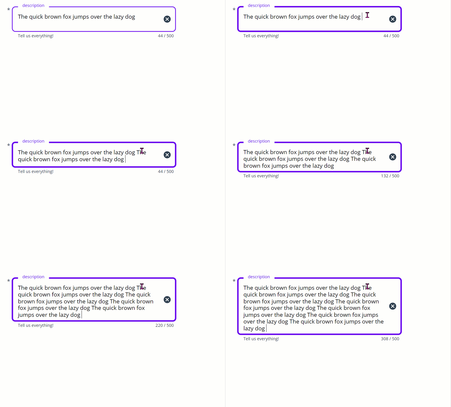
Some controls in Power Apps do not have an auto height property, which means that we can’t get the Height of a control to automagically ✨ adjust to its content. Especially for the textinput control, this is a real bummer, as we a user’s input a pretty much unpredictable. On the one hand, we do not want to waste precious screen estate by making the box as big as possible, on the other hand, a too small box will result in an endless scrollbar which is a bad user experience.
Build a component with me
If you follow my blog posts then you might know that I love to componentize everything that I’d like to use again, and an auto-height textinput seems to tick that box as well.
- Open make.powerapps.com
- Create a new component
cmp_textinput - Create a custom input property outsideMargin (Number),
20- determines the margin around the component - Create a custom output property userText (Text),
txt_userInput.Textso that we can pass this value back to our app
Make magic work
- Insert a text label
lbl_autoHeightHelperand a textinputtxt_userInput - Make sure that the textinput sits on top
- Set the Mode of the textinput to
Multiline - Set the X and Y of the textinput to
cmp_textinput.outsideMargin - Set the Width of the textinput to
cmp_textinput.Width-2*cmp_textinput.outsideMargin- this makes sure, that when you horizontally resize the component, this also applies to the textinput as well - Set Height of the textinput to
Max(42, lbl_autoHeightHelper.Height) - Set the Text of the text label to
txt_userInput1.Text - Set X of the text label to
txt_userInput1.Xand Y totxt_userInput1.Y - Set Width of the text label to
txt_userInput1.Width - Set the Height of the text label to
cmp_textinput.Height-2*cmp_textinput.outsideMargin - Set the auto height of the text label to
true - Set the Color of the text label to
Transparent - For the text label, set Font to
txt_userinput.Font, FontWeight totxt_userinput.FontWeight, and Size totxt_userinput.Size - Set the Width of the textlabel to
txt_userInput.Widthand the Height toMax(42, lbl_autoHeightHelper.Height)
Understand the magic
- We utilize the auto height property of the text label and hook it to the Height property of the text input. The text label will get exactly the text in the Font, Size, FontWeight of the textinput, but as we set the Color to
Transparent, it won’t show up. - For the Width of the text input, we reference the width of the component itself so that we can make the textinput as wide as necessary by adjusting the size of the component instance in an app
- The
Max(42, lbl_autoHeightHelper.Height)for the Height of the textinput ensures that we always have 42 as a minimum Height and the Height of the text label (which has auto height enabled) as maximum Height
Feedback and what’s next
That’s it!
a little hack to bring auto-height to controls that don’t come with it out of the box. Let me know what you think on twitter.
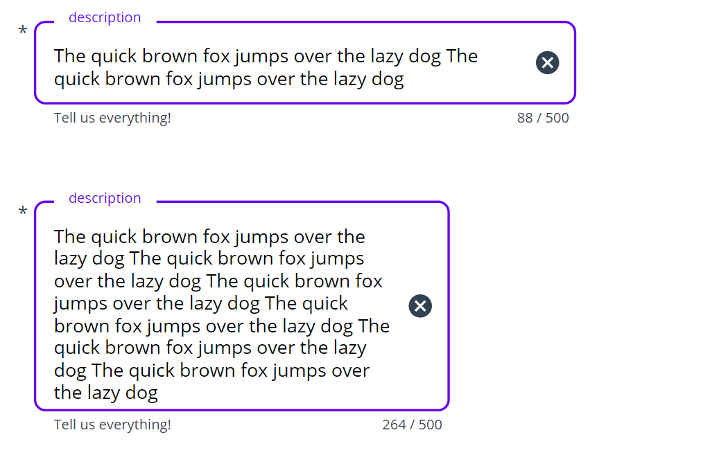
Maybe you could spot in the screenshot above, that I added some more cool features to my component, such as a trailing icon (delete, error), a label, an asterisk. a helper and an error text, and an indicator of how many characters are still left. This is a sweet sneak preview on a Material design component library that I am building together with my dear friend and partner in crime Robin Rosengrün.
If you want to know more about it and/or you found this blog post useful, please also subscribe to my newsletter - news coming about every 2 months, I promise to not spam you!
You May Also Like
Series: Build Power Apps that don't look like Power Apps - Material Design part 2
For real, your low code apps don’t need to look like as if design wasn’t important. I hear lots of people say, that they suck at design or don’t have an eye for good UX. But a …
Series: Build Power Apps that don't look like Power Apps - Material Design part 1
One of my most important goals when developing Power Apps is good design. But for me, Design is not just pretty looks or some stunning effects, but it is how things work. This means that a well …
Get started with planning your Power Apps components properly
Power Apps components are awesome, still I do not see too many organization using them, which is why I want to give some guidance on how to better plan and build components. Proper planning can save …
